Showing posts with label studies. Show all posts

Tuesday, October 14, 2014

SmART School Week 6

Rebecca had told me to do one more color study off of her correction, and bring that into class to confirm that I understood where she wanted me to take my color.


This class was mostly me getting the go-ahead on getting the painting itself started: my study was more or less there, and the corrections Rebecca had were minimal (which is good, because something with the Dropbox screwed up and the paint over files disappeared).

So I started the painting.


There is nothing quite like the hatred and despair of a first scrub-in, where everything is awful and nothing works. Usually it's not quite so dramatic, but this was a palette I was still adjusting to, and I've been fighting off a cold/fever for a bit now which of course makes things harder to be positive about.

Usually when I get like this, where my emotional response to my piece is ">:|", the answer is I have to pick a part and just render the crap out of it, to give me something to feel good about.


I kind of lost the drawing in the hand I was working on, and clearly didn't get to the left hand at all, but this makes me happy. Cutting into the hair and getting in the volume of the flesh has gotten my momentum rolling again after what seemed like five years of color studies, haha.

Beyond working on this, I also started thinking about my next piece. I had originally been intending to work on a commission for a friend, and had even taken reference - but it's another ethereal lady with a tree, and doing two of those in a row seemed like a poor choice. So I started looking through my stock of unused thumbs and unexplored projects.


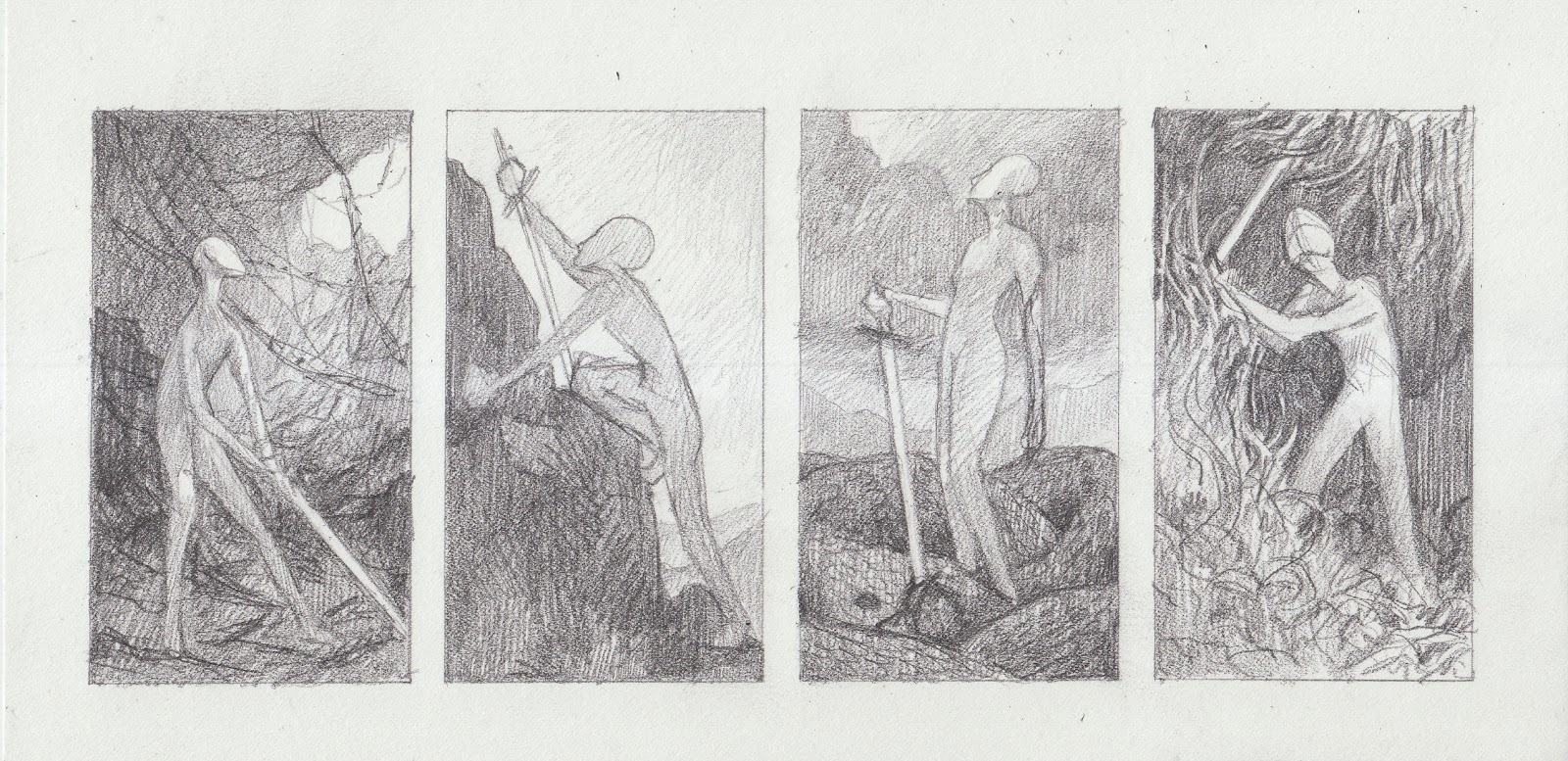
What I found was the original set of thumbnails I did for the IMC from the summer before last. I'd dropped these in favor of what eventually became The Long Path, and for good reasons - but there was something about these that made me come back. Rebecca chose number one, and I started to gather reference for my frankenstein as the week ended.


I have more to do before this is ready to go to drawing, and I need to figure out what part of my gesture is actually achievable by human bodies, but the heart of the painting - Oberon's gesture - is there. Exciting!

Tuesday, October 7, 2014

SmART School Week 5

This was a kind of frustrating one.

I had spent the previous week running headlong at a deadline and Rebecca had told me not to worry about the stuff I was doing for Belle Dame, but back before that commission had hit she'd asked me to pull up one of Waterhouse's multi-figure paintings to key off of, and I had enough time to do that.


In class, I got some final critique from Rebecca on my cover, and then mentioned that I'd also put this into the folder. "This is the one I'd been thinking of!" she said. "I want you to use it like a map."

As I sat down to do just that, I'll admit that there was frustration even as I understood why this was important to do. This was like nothing like I'd been shooting for in my studies - beyond the fact that I'd been going for a different palette, this was so much more chromatic, and had much more contrast, than anything I'd pictured for the piece. This was, in my thinking at that moment, a left turn from image that had been forming in my head.


My frustration turned the 'map' study into a gross muddy mess, which in turn only furthered my frustration. I knew why Rebecca was having me key off of Waterhouse so directly - we'd discussed how he was a master of limited palettes and using contrast and chroma like scalpels, all if which I aspired to - but all I could see was a horrible color study. (It's dumb, looking at it now and seeing how I was pulling down my chroma in really gross ways, paying no actual attention to value... congrats on setting yourself up for failure, Jenna.) So I did another one, more in-line with the mood I was fixated on and the colors I was comfortable with, and sent them off.


Rebecca returned a color study with the actual clear separation of values and handing of color that I'd missed in my stew of 'but it's not working ): ): ):'. She told me to do a study off of hers (with the Waterhouse nearby), and then go to paint.

Which is, of course, when I got sick. So I'm bringing in the study and not really anything else today to class, which is a bad feeling in and of itself, but at least I know I'm just shy of actually getting to paint.

But man, I forgot how hard it is to break out of comfort zones. It's a gross, uncomfortable process. I like to think that I push myself in my art, but there's always that edge that I shy away from before I even get close, and in doing so it's easy to forget it's there at all. I've been out of school for a couple of years now, and the IMC is more about flying by the seat of your pants past your own limits than about methodically working on your ruts and comfortable old ways of thinking.

This is the first real block I've encountered in Rebecca's class thus far, which kinda gives me something to judge myself against: where I am in the steps leading up to this is clearly something to be proud of, because she is absolutely nailing me to the wall over my color and value and let everything previous by with varyingly minor degrees of critique.

So, alright. This is where I set my shoulders and work, then.

Tuesday, September 30, 2014

SmART School Week 4

Whoops, I'm writing about last week's class literally while sitting in this week's class.

So what I brought to class last week was more prepwork, gearing up for the jump to paint.


I'd done that set of color studies for the mid-week critique, and gotten some good feedback from Rebecca about how I was losing my value structure in pursuit of these colors I had in my head. The solo study was done larger, so I could zone in a little more on what I was trying to do. I also got the drawing on the board and scrubbed in a value study.

However!

I also brought something completely different into class!


This has nothing to do with Belle Dame Sans Merci. But that weekend previous, as I was sitting in a lecture at Illuxcon on September 20th, I got an email enquiry about doing a cover for an ebook release of a book. The enquirer was the book's author, Elizabeth Bear, and the deadline for the cover going live was October 4th.

I did thumbnails that day and got one approved, and did my drawing on the day after I returned from Allentown, and I brought it to class because I had gone from nothing to a final drawing in less than four days and just knew the panic was affecting my judgement. 

I'm going to make a separate post about the process of this cover, but I just want to say that I could have wept with gratitude over the critique I got. I went from a drawing that is a bunch of poor decisions stitched together awkwardly, with a figure who was just miles away from the mark, to.... well, I'm sitting here with a finished painting waiting for one last critique round, aren't I? :D

Monday, September 15, 2014

SmART School Week 2

The run up to week two saw me kind of miserable - not because of overall miserableness, or because I was disappointed in the thumb chosen, but because all I had to bring in was one sketch. I mean, it was all I was supposed to bring in, but it just din't seem like enough. I whined to my long-suffering roommates on this very subject for the entire process of drawing this.


I was braced to apologize for my lack of work... but then class came and actually Rebecca loved it. (My notes for class included, "!!!" in several different spots.) There wasn't a lot of critique to give (??!) because, as Rebecca said, the final drawing was where she was going to nail me to the wall over every detail, whereas the sketch was only really good to show my composition, value, and gesture. 

Here's her paintover, with some noodling with the idea of a translucent dress. All I basically have to fix are some gestures that can be made better, and some tangents.


Let me tell you, I was kind of taken aback. I'm a few years past the bad artistic self-regard issues I had from college, but it still leaves me a bit bewildered to present a sketch I think of as a sad minimum and receive praise, encouragement, and minimal things to fix. Next to some of those !!!s were ???s, haha.

(I also brought some studies to class. The dress ones were kind of worthless, but the armor was definitely worthwhile.)


My drawing is due tomorrow. Let's see how that goes, yeah?

Saturday, August 17, 2013

Return from radio silence!

I've been pretty much absent for the past month, for various reasons, but I return to the light of the internet with progress on my art!

First up, the piece I was calling Far and Away but is actually still working on a title.


That is a first pass plus some extra poking at the arms plus glazing, aka a first pass plus procrastination because the next step is the first go at the mosaic wall. Some of this is... sloppy, and I absolutely lost the drawing of the left shoulder where it meets the hair, but it's all within acceptable parameters for a first pass and I'm pleased with were it's going.

Next, something that has the title that the previous piece used to have: Far and Away


It's ready for a tighter drawing, a reference shoot, and color studies, and I'm excited about what this looks like in my head.


Lastly, something I've been trying to do, in one way or another, for something like six years: an illustration for Sabriel. This thumbnail is one of a batch that I did in my sketchbook last month, and while it's still obviously very rough and not much bigger than my actual thumbnail, there's something in this one I keep coming back to.

Sabriel has defeated my every past attempt to illustrate. The book itself is so important to me, something that's been a dear favorite for something like thirteen years (???) - and it's hard to get around an emotional wall that thick, to see past it to what I need to do for my image. Beyond that, the cover illustration is foundational to me. This is an image that hits almost physically when I see it unexpectedly, that I still think of as the perfect illustration in my heart of hearts. Trying to create my own image, that's not only not a Dillons rip-off but also something that I can accept, as a fan...

...that's tough.

So in the meantime, while gingerly working through that set of issues, I did studies - including working out how the bells hang off of the bandolier. (I'm pretty proud of my design, not gonna lie.)


Friday, June 7, 2013

IMC assignment, take 2

So, about that last post -

- some peers and also Dan Dos Santos gave me feedback which amounted to 'you are really in your comfort zone/you're better than this/push harder push harder', and when I went back to the thumbnails I came to the realization that I just... had nowhere to go with them. There's a lot of emotional exhaustion tied up in them, both from the timing of having my awful crash on the same day as the assignment email came out, and from the fact that I just don't like A Midsummer Night's Dream to begin with, really - and I decided that discretion was the better part of valor.

Also contributing to the decision to abandon/step away from my Midsummer illustration was my acceptance to Light Grey Art Lab's October show, Rolemodels. The piece for it is due mid-July, and if I had waited to start on it until after I returned from the IMC, I would have had less than a month to do it from thumbs to finish, coming off of a week that last year not only left me exhausted, but also emptied my artistic tank down to nothing.

Beyond the way that the timing works for doing the Rolemodels piece at the IMC, it's an image I'm really, really excited about. I was already exhausted by Midsummer and I hadn't even gotten out of the thumbnail stage - but every stage of this piece so far has been nothing but inspiring.

The show itself is for D&D-type fantasy self-portraits, with all of the artists being one of several classes and having to represent themselves through that context. I'm a paladin in this case, a religious warrior, and I (being spiritual but very non-religious) was shocked to find a D&D-canon deity that really did fit: The Path of Light, more philosophy than god, which holds its adherents to honing their personal skill and following the light.

As I was thumbnailing I found myself drawn again and again to the struggle of following that light - I shied away from triumphant poses (that one thumb aside) and focused on the journey. The thing about the thumb I chose, the thing about the sketch I did, is that I feel in it the exhaustion that I know intimately, but also the hope and the urge to go forward.

I hope that the painting can carry that sense of weight and forward motion.


Friday, March 15, 2013

Drawing at the Met

I'm working on a new post, about discipline and preparedness and overcoming disgust in oneself when it becomes apparently those things are absent --

-- but since that's taking a while, here are some drawings I did at the Met yesterday.


I am really usually not so successful with these types of studies. Perhaps I just hit the right way to render, and the right size? The top one is the length of my thumb, the bottom one a little bigger.

Sunday, December 30, 2012

Riverdaughter Drawing

Because Holding the Pass is still fighting me, I have the drawing for my next painting ready to go:


The values are actually almost perfectly flipped there - it's going to be a fairly dark painting, with the flesh portion of the nymph being almost white against a deep green tail. Observe:


Here's the study, drawn doublesize of the final because drawing a back is hard enough by itself:


Sunday, June 3, 2012

Frost Giant Groundwork

The last time I worked with Tyler Jacobson as my mentor for an illustration, the results were pretty good - so when I spoke to him at Illuxcon and he asked me if I'd be interested in doing another one, I jumped on the chance.

My process is a lot different than it was almost a year ago. There's no perfect drawing to show yet, because I just finished shooting my reference (where 'finished' might be a very generous term), but I've done the prep work that should make the painting itself go smoother.


This is a barbarian woman and a rogue fighting a frost giant. It's a D&D art order, like the Elf Cleric, but as before Tyler's letting me use it as a point of departure as opposed to a part of an accepted canon. To that end, I purposefully did not look at the descriptions for the Rogue or Barbarian classes, nor for Frost Giants. When I read the piece's description, all I could see was Jesper Ejsing's paintings in my head - and while I should be so lucky to have his handle on color and action, and in the end don't have anything approaching his sensibility, I wanted to stay as far as possible from making an illustration that looked like an Ejsing knockoff in a low-chroma palette.


Speaking of low-chroma palettes, I'm going to be trying one of the warmer ones - probably the last study of the set - with upped cool tones in the frost giant itself and touches of it elsewhere.

The next thing to do is the drawing, though with the IMC coming up and work starting soon, we'll see how fast I get that done.

Monday, May 28, 2012

IMC 2012 Assignment Prep 2

Because I suppose it's making me anxious not to have the photoshoot done, I sat down and did some studies for Tristan and Isolde.


The 'clothing studies' are mostly notes and doodles of borders and trims, because until I have my reference in hand I don't really know how the clothes are going to need to be built - and because doing anything super solid before The Critique seems somewhat silly.

In the end, the clothing itself isn't going to be complicated. Big dramatic drapey dresses would be incredibly fun to draw, but a) they'd take more careful referencing than I'm able to do at current; b) even assuming I had the reference, it would take more time to paint than I really have; and c) in the end, the feel I want from this illustration wouldn't actually support a design like that. What I'm concentrating on are the characters and the emotion of the story and scene, and having really ambitious clothing would pull focus from that (whether because it would overpower the subtle things I'm going for or because it would just be that badly painted is up for discussion...). Simple clothing - an understated tunic and hose for him, a plain white dress for her - makes my job a lot easier, and means that a little will go a long way in terms of decoration.


I wound up only doing a couple of color studies. I knew what I wanted basically from the get-go, leaving only a question of whether I wanted to go low-contrast and low-chroma, or higher-contrast and -chroma. I've decided on the latter, because although I love me some dreamy, neutral scenes, this is not the illustration for it. The bright warm light will play off of the cool shadows in a really lovely way, if I manage pull it off...